Share this
Best Dental Website Designs of 2019
by Analiese Kovisto on Nov 4, 2020 10:00:00 PM
As the holiday season wraps up, we wanted to share some of our favorite dental website designs from 2019. I've added comment about why these were our top selections, but they aren't shared in any particular order.
#1. Westport Plaza Dental Associates
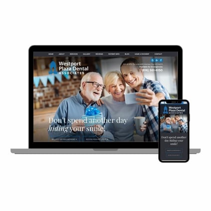
I know I just said they weren't shared in any particular order, but Westport Plaza Dental Associates is probably my favorite dentist website we launched this year, not just because I'm a sucker for blue and gray designs.
While the banner images are stock images, they don't have the same super cheesy, awkward images that give the industry a bad reputation. They look like they could be your family and friends and the image selections mirror the colors used on the site design.
When you scroll down on the homepage, you are shown content that talks about why you, as a patient, should pick their practice rather than just talking at the users and making unsubstantiated statements. It's easy for a user to find the key selling points and quick links to pages that may be of interest to them.
#2. InSmile Dental
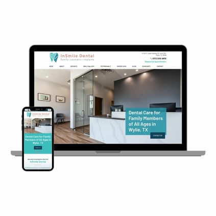
You'll see several similarities in why I like certain sites, and just like our first, InSmile Dental did a great job at showing off their amenities and selling points on their home page. I also really like that their testimonial section displays images of the patients who left that review. Obviously, you would need to get permission from the patients, but what a great way to build more of a connection with users and make the reviews seem that much more authentic.
I also really like how modern the website and the practice design feel. It's very open and airy and does a great job giving the user a sense of what to expect when they come in for their first visit. I do with their office tour had more "life" in the images, which is simple enough to add by just having a person in a few of them. Regardless, the images and the design are clean, simple, and modern.
#3. Gasoline Alley Dental
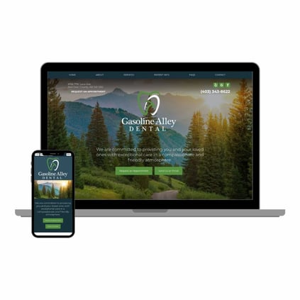
Normally, I prefer to see people or practice pictures for the main banner image. However, local landmarks and points of interest can be a unique way to connect with website users as well. Gasoline Alley Dental accomplishes this tactic by the use of the visually stunning landscape imagery, paired with muted color schemes.
I also like the centered logo and calls to action rather than the more standard off-centered content. It's not a huge difference from the others, but it works really well and provides a nice balance to this website.
The other thing I noticed about this site right off the bat was how simple and clean their navigation is. A lot of practices want to put everything in the navigation bar, but sometimes, less is more. This is especially important for practices that serve an older population, as it makes it less confusing for users to find what they need and know where to click without getting overwhelmed.
#4. St. Louis Pediatric Dentistry
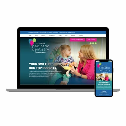
We LOVE working on pediatric dentist websites. Aside from being able to use super cute images, we generally get to use different animations, use bright colors, and they just have a more fun look at feel than most general practices (not that we don't have some really cool general sites!).
St. Louis Pediatric Dentistry particularly stood out because of the custom images throughout the entire site. Parents are very cautious about the medical practitioners they select for their children, and this site does a great job at introducing the people who will be caring for their kids.
Also, I'm sure this was planned, but if you notice, the tops that each dentist is wearing each matches one of their brand colors. It really ties the site together.
#5. Alta Dental Studio

Here's another great example of a sleek, modern site. I love the use of whites with the mix of metallic golds and steel colors. Also, Alta Dental Studio did a great job with their logo. It's easy to go wrong with design trends like geometric icons, but the overall feel of the tooth icon with the typography used for the name works really well.
I also like the graphics used towards the bottom of the homepage that not only animate when you scroll over them, but also have another animation when you scroll off of them. It's a small detail, but it adds a little extra flair and keeps the somewhat chromatic theme from getting boring.
#6. South Des Moines Dental
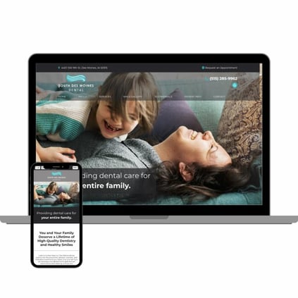
The Midwest had a strong year for dental website designs! South Des Moines Dental has a similar feel to our first site with the grays and blues, but still has enough differentiators to make me pick it for different reasons.
You'll notice the other sites we've already gone through have the address and contact button right in the header with the phone number and social links. This site takes the address and appointment button above the main header area, making it stand out and makes it less busy than some other headers.
I also really liked how this family focused practice did a great job at keeping the content and imagery so united. Sometimes, we see a lack of continuity between what a practice selects for images and how they want their content written.
If you're ready make over your dental website or you're looking to chat about a new design, contact us today! Hopefully you'll see your site on our next annual website design roundup.
Share this
- November 2024 (1)
- October 2024 (4)
- February 2024 (1)
- January 2024 (2)
- December 2023 (1)
- November 2023 (1)
- October 2023 (1)
- September 2023 (2)
- August 2023 (4)
- July 2023 (3)
- June 2023 (2)
- May 2023 (1)
- April 2023 (3)
- March 2023 (2)
- February 2023 (2)
- January 2023 (3)
- December 2022 (2)
- October 2022 (3)
- September 2022 (2)
- August 2022 (2)
- July 2022 (1)
- June 2022 (1)
- May 2022 (1)
- April 2022 (5)
- March 2022 (4)
- February 2022 (20)
- January 2022 (14)
- December 2021 (1)
- November 2021 (4)
- October 2021 (1)
- September 2021 (2)
- August 2021 (12)
- July 2021 (40)
- June 2021 (2)
- May 2021 (5)
- April 2021 (7)
- March 2021 (4)
- February 2021 (13)
- January 2021 (5)
- December 2020 (3)
- November 2020 (24)
- October 2020 (37)

