Share this
Blog UI Update
by Great Dental Websites on Oct 28, 2020 10:00:00 PM
One of the bigger projects that we’ve been working on in 2019 is the UI overhaul, which means pages on our platform are getting a makeover! The most recent page to receive a facelift is our Blogs page.
Our team researched and gathered feedback from clients to put together a sleek, modern look for the admin page, main page, and individual Blog landing pages.
Admin Page:
For the Blog admin page (where you go to create/ edit Blogs), you’ll see some things have been rearranged for a more intuitive layout. You’ll now have the option to upload a banner image for the blog. This image must be 1800 pixels wide and will be found at the top of the individual landing page. Your featured photo will appear on the “View All” blog page.
After some research, we have chosen to remove the option to add “Tags” to a blog post. However, if you had previously been adding tags, you will still see those on your older posts, and a user can click into the tag to see older blogs that shared the same tags.
Main Page:
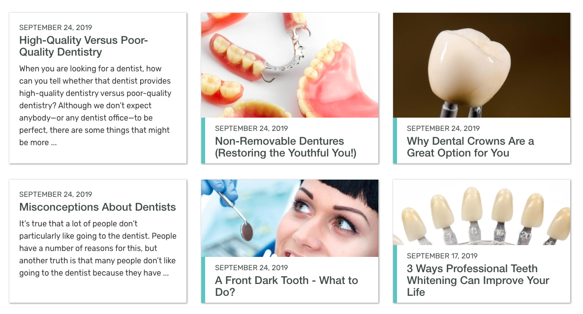
For the main Blog page, you have two different layouts to choose from, Module (default) or Card. To change the layout, you can go to Site Settings, and search for Blog Layout. For both layouts, you’ll find that the 6 most recently added blogs will be displayed first, then there is a “Load More” button at the bottom, which will load the next 6 blogs.
You can also find the associated services at the bottom of the page. Clicking into a service category will provide all the blogs associated with that service.
Card Layout:
The card layout is ideal for those with consistent images that fit our default aspect ratio. It is also ideal to use this layout when your blog has shorter titles.
It is a minimalist layout, with only the date, title, and image shown. Or, if no image, the date, title, and short blurb.
To get the read more link, you simply need to hover over the card.

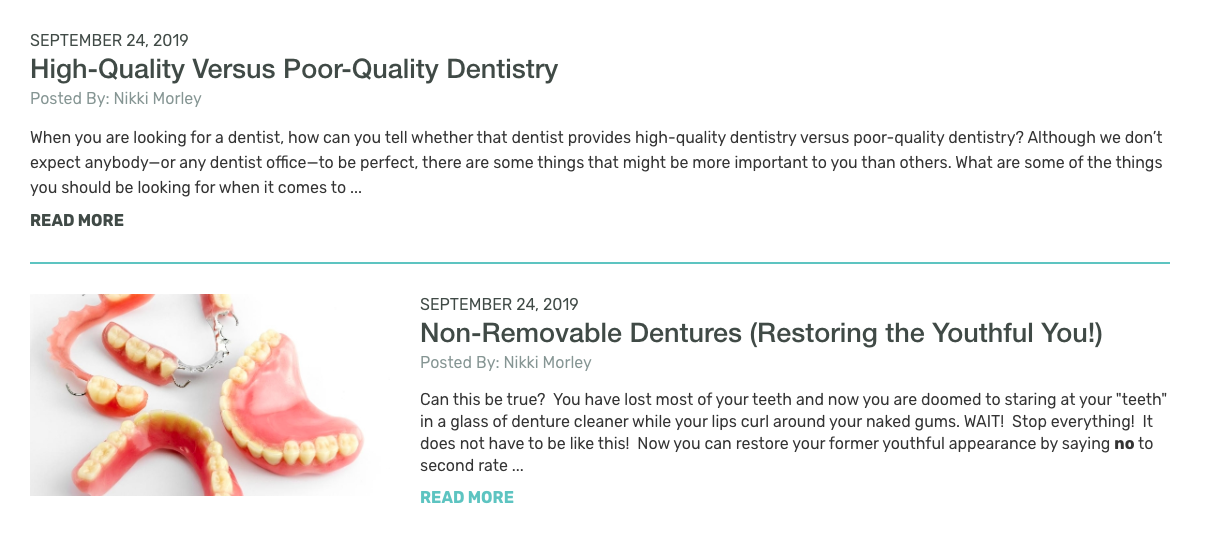
Module Layout:
This layout is very adaptive and is a great option for blogs that have a lot of varying content such as the following:
- A 50/50 ratio of blogs with images and blogs without images
- Blogs without any images
- Image sizes that are different aspect ratios than our cropper.
This layout shows image, date, author, and preview of the text.

Individual Blog Post Page:
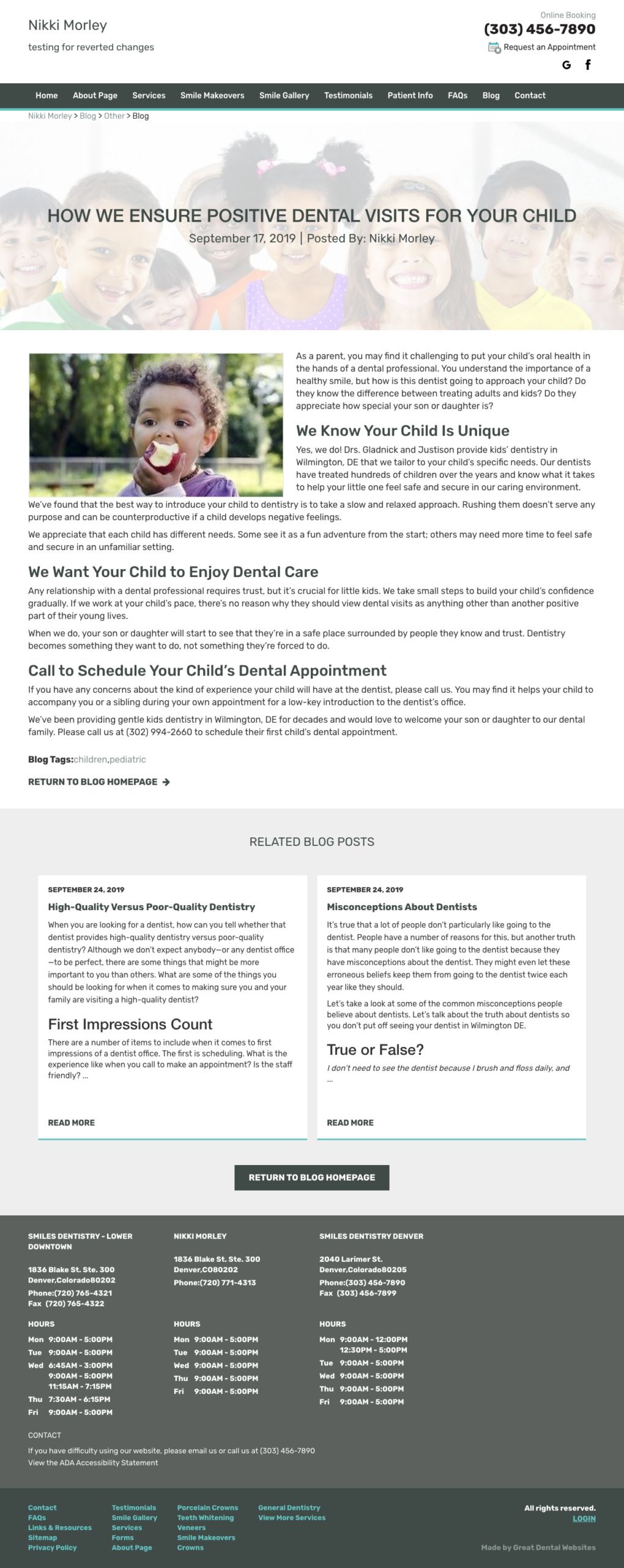
This page is designed to have a cleaner layout and the option to add a custom banner image overlaid by the title of the post, date, and author.

Related Blog posts will show below the main blog post content and will show up to 3 posts, like the service pages.
Below the content, we will also have links to any related services or any listed blog tags. Clicking on the services link will bring you to that service page.
Clicking on any of the blog tags will bring you to the main landing page of all blogs associated with that tag.
This update will be automatically applied to our clients who are on the new UI layout already. If you do not see these changes and would like them applied to your website, please contact your Account Manager or our Support team.
We are excited about this update and what’s to come, stay tuned!
Support contact information:
support@greatdentalwebsites.com
720-399-7071
Share this
- November 2024 (1)
- October 2024 (4)
- February 2024 (1)
- January 2024 (2)
- December 2023 (1)
- November 2023 (1)
- October 2023 (1)
- September 2023 (2)
- August 2023 (4)
- July 2023 (3)
- June 2023 (2)
- May 2023 (1)
- April 2023 (3)
- March 2023 (2)
- February 2023 (2)
- January 2023 (3)
- December 2022 (2)
- October 2022 (3)
- September 2022 (2)
- August 2022 (2)
- July 2022 (1)
- June 2022 (1)
- May 2022 (1)
- April 2022 (5)
- March 2022 (4)
- February 2022 (20)
- January 2022 (14)
- December 2021 (1)
- November 2021 (4)
- October 2021 (1)
- September 2021 (2)
- August 2021 (12)
- July 2021 (40)
- June 2021 (2)
- May 2021 (5)
- April 2021 (7)
- March 2021 (4)
- February 2021 (13)
- January 2021 (5)
- December 2020 (3)
- November 2020 (24)
- October 2020 (37)

