Share this
New Software Update: Financial Pages
by Great Dental Websites on Nov 4, 2020 10:00:00 PM
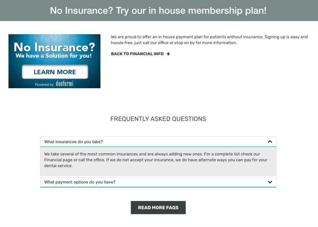
Our UI (User Interface) overhaul project continues with the release of our new Financial Page functionality. Because of this release, you will find that it is easier to incorporate third party photos and links (such as CareCredit, In-House Financing, etc) into individual Financial entries. In addition, we've updated the layout to provide a cleaner, sleeker look.
Admin Page Changes
On the admin page for editing a Financial entry, you will find that there are a few new options to “customize” the entry.
The first new option you’ll see is adding an “icon” that is relevant to the type of Financial listing. The icons default to “No Icon” but offer a selection of icons that could be used for a variety of entries.You can select one icon and it will appear next to the title of the entry on the main Financial page.

Call-to-Action Button
At the bottom of the admin page you will see new fields for adding links to your Financial entry. You now have the option to add a CTA (call to action) link, and hyperlink the uploaded image.
The CTA button is a new button our clients can use for Patient Portals, Online Payments, etc. There are two fields required for this button to appear: the "Button Text", and the "Button Link."

Button Text: This is where you’ll add the text you want to see in your button.
Button Link: This is where you want to put the url you want your button to link to.
CTA Image Link
The Logo/ Image Field will allow you to hyperlink the image that you uploaded in the Logo/ Image uploader at the top of the page. This will be useful for clients who use third party companies that provide an image that says “Click Here!”. All you need for this field is the link you would like the uploaded image to go.

Main Financial Page Changes
Our main page (the page you see that ends in /Financial-Info) had some minor overhauls of the individual entries. Iconography was added as an option to appear next to the H2 (the sub-headers), text styles were updated for Read More to look like the other previously overhauled pages.

Additionally, specials are now listed on the bottom of this page in a rotating slider and FAQs in the “Other” category are shown.
Individual Financial Page
This page is only shown if the site setting Financial Display Type is set to Separate Pages.
It’s a fairly simple layout with the title as the H1, the content as it is on the main page, and the FAQ module below.

Like previous updates, this update will be automatically applied to our clients who are on the new UI layout already. If you do not see these changes and would like them applied to your website, please contact your Account Manager or our Support team.
We look forward to sharing more platform updates with you!
Support contact information:
support@greatdentalwebsites.com
720-399-7071
Share this
- November 2024 (1)
- October 2024 (4)
- February 2024 (1)
- January 2024 (2)
- December 2023 (1)
- November 2023 (1)
- October 2023 (1)
- September 2023 (2)
- August 2023 (4)
- July 2023 (3)
- June 2023 (2)
- May 2023 (1)
- April 2023 (3)
- March 2023 (2)
- February 2023 (2)
- January 2023 (3)
- December 2022 (2)
- October 2022 (3)
- September 2022 (2)
- August 2022 (2)
- July 2022 (1)
- June 2022 (1)
- May 2022 (1)
- April 2022 (5)
- March 2022 (4)
- February 2022 (20)
- January 2022 (14)
- December 2021 (1)
- November 2021 (4)
- October 2021 (1)
- September 2021 (2)
- August 2021 (12)
- July 2021 (40)
- June 2021 (2)
- May 2021 (5)
- April 2021 (7)
- March 2021 (4)
- February 2021 (13)
- January 2021 (5)
- December 2020 (3)
- November 2020 (24)
- October 2020 (37)

