Share this
New Pre-Designed Themes Coming!
by Great Dental Websites on Jul 15, 2021 2:02:44 PM
It’s been a while since we last updated our pre-designed theme library, so we’re excited to announce that 2 more are coming in the near future!
Note: each theme will have multiple color themes to choose from, the ones pictured are just to show what the designs will look like.
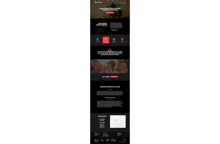
Theme 1:
Who doesn’t love a bold design? This theme is eye-catching and user friendly! The light and bright colors stand out against the dark background without making it hard to read. Even though it’s darker than most of our theme options, it doesn’t feel cramped and dated as many dark websites have a tendency to do.

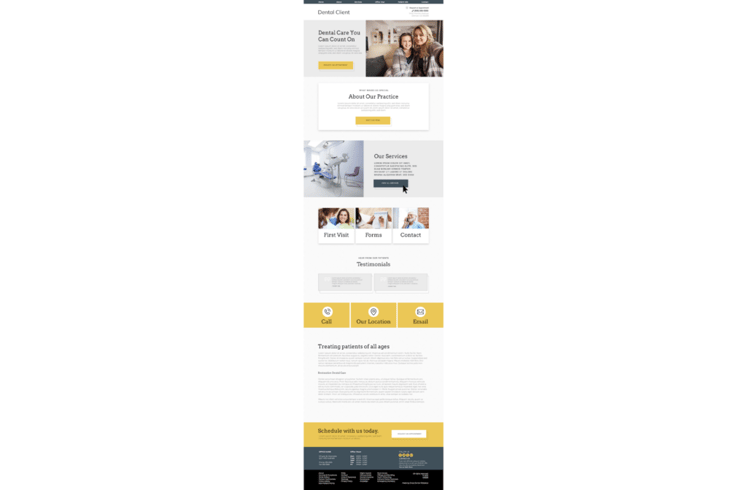
Theme 2:
We’re internally calling this theme a “lightweight” design as it removes a lot of the animations and moving elements that many of our sites use. It’s perfect for areas with less-than-reliable internet connections or practices serving older patients who might not like the movement on a page.
It’s simplistic without sacrificing style - letting your patients know that you are still a modern practice ready to serve their needs.

We’re finishing adding the final touches before we roll them out, but expect to see one within a week and one in May!
If you are ready to refresh your look, contact us today. Don’t forget, any pre-designed theme can be upgraded to a semi-custom if you want some more options and control at a lower cost than a custom design.
Share this
- November 2024 (1)
- October 2024 (4)
- February 2024 (1)
- January 2024 (2)
- December 2023 (1)
- November 2023 (1)
- October 2023 (1)
- September 2023 (2)
- August 2023 (4)
- July 2023 (3)
- June 2023 (2)
- May 2023 (1)
- April 2023 (3)
- March 2023 (2)
- February 2023 (2)
- January 2023 (3)
- December 2022 (2)
- October 2022 (3)
- September 2022 (2)
- August 2022 (2)
- July 2022 (1)
- June 2022 (1)
- May 2022 (1)
- April 2022 (5)
- March 2022 (4)
- February 2022 (20)
- January 2022 (14)
- December 2021 (1)
- November 2021 (4)
- October 2021 (1)
- September 2021 (2)
- August 2021 (12)
- July 2021 (40)
- June 2021 (2)
- May 2021 (5)
- April 2021 (7)
- March 2021 (4)
- February 2021 (13)
- January 2021 (5)
- December 2020 (3)
- November 2020 (24)
- October 2020 (37)

