Stock photos can be a crucial part of your dental website because they add interest to your site pages and sometimes help illustrate specific procedures or services you offer. Stock photos are also helpful if you don’t have the time or the means to take custom photos for your dental website.
However, knowing the right photos to choose and which ones to avoid is essential. After all, your goal is for your website to bring you new patients, not send them running away as fast as they can.
In 2020 we took a break from our regular blog posts to bring you an illuminating and sometimes hilarious look at some of the worst dental stock photos we’ve encountered. We’re back with a few more to add to your “do not use” list.
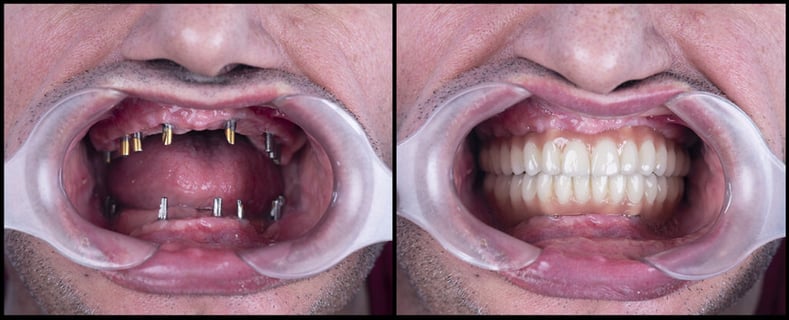
#1 Up Too Close and Personal With Dental Implants

We know that you’re excited about dental implants and what they can do for your patients. However, there are better ways to share this excitement than assaulting them with the excruciating honesty of these pictures.
Yes, this is indeed how dental implants look and the result of what they can do for you, but most people don’t want to know how the sausage gets made. So, stick to the after photos, so you don’t scare anyone away from dental implants.
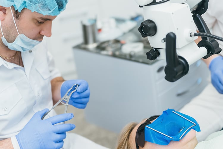
#2 Dentist Treating Patient

Again, with sausage on this one. No one really wants to see a dental treatment taking place over a photo of a smiling couple with nice teeth, especially when there appears to be a gaping hole where the patient’s features should be.
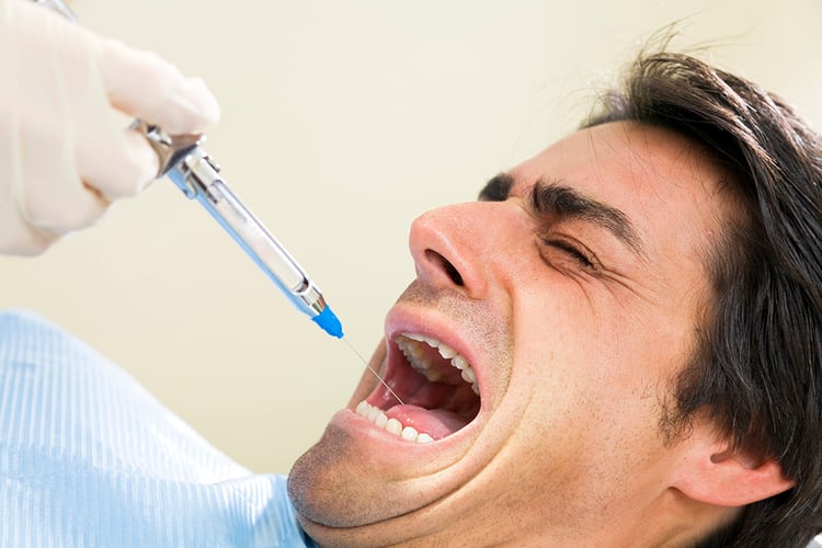
#3 Just Say No to Needle Photos

As a good rule of thumb, we’ve found that it’s typically best NEVER to show pictures of needles. Especially if you’re trying to present your dental practice as a peaceful, relaxing, and calming environment. This poor man may not recommend this dentist to his friends.
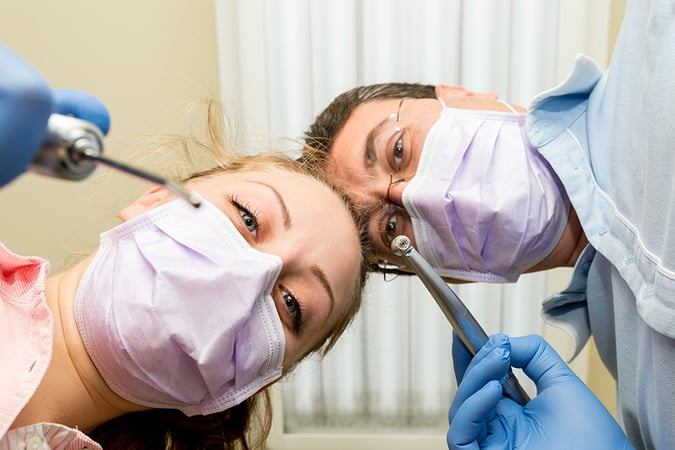
#4 Patient’s Point of View

“I love watching my dentist come at me with a drill,” said no one, ever! If you’re trying to attract nervous or fearful patients to your dental office, this is not the photo you should choose.
#5 Pain and Suffering

It’s hard to show a decent depiction of the intense pain that tooth decay or dental infection causes. This photo, however, makes the pain look like it might just burn the gentleman’s fingers off as well.
Does Your Website Need a Photo Overhaul?
We’ve given you some examples of photos you shouldn’t choose; however, if you need to update your website’s pictures and need some direction, your team at GDW is happy to help!
Custom photos are excellent if you have the time and budget to take them and then add them to your website. If not, there are still plenty of good stock photos out there that can help you portray your dental office the way you’d like.


-2.png)
.png)