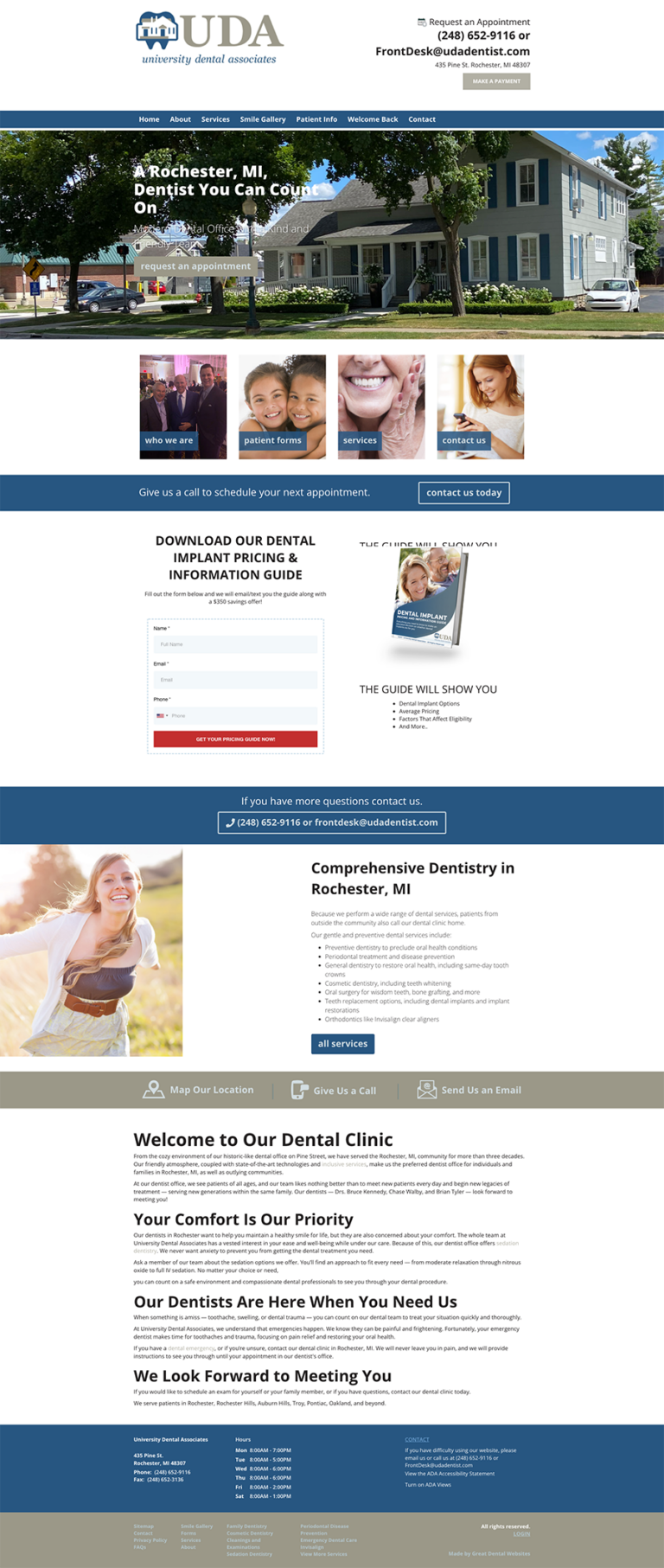
A Classic, Hometown Feel
UDA brings prospective patients right to their friendly neighborhood practice upon entry to their site with a banner photo of the outside of their office. The site implements the use of images and bold text and headlines to communicate information about the practice, making the site easy to navigate. Additionally, the site's color scheme matches their logo and physical office, making the entire website cohesive.


